Flower Chart
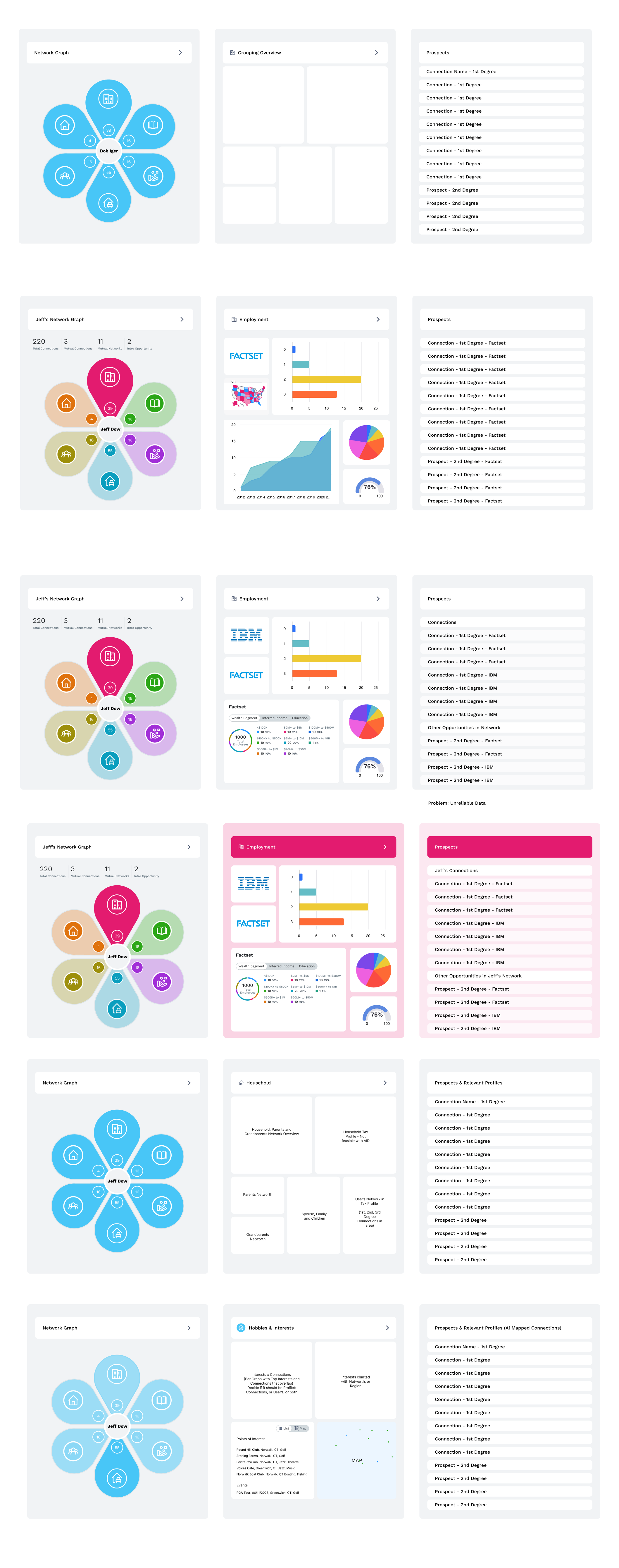
What if there were no engineering constraints? What if creativity could drive the redesign of the network graph? Could I completely reinvent how we visualize network data? The flower chart is inspired by a project I created for an Ai deduping company in 2019. By clustering data, like petals in a flower, I can group and map an infinite amount of connections. Instead of using nodes and edges to map a person’s influence, I focused on grouping connections by networks and milestones. This is a creative and novel way to map people data. When tasked with designing a network graph for Factset, I brought back this concept for consideration. The MVP I decided to ship used an org chart visualized in the pages on my portfolio. One day, I hope to be able to bring this innovative concept to life and introduce a new and creative way to map a person’s profile. I have even used this concept to predict who people might become in the future (See Hackathon Project on Homepage).